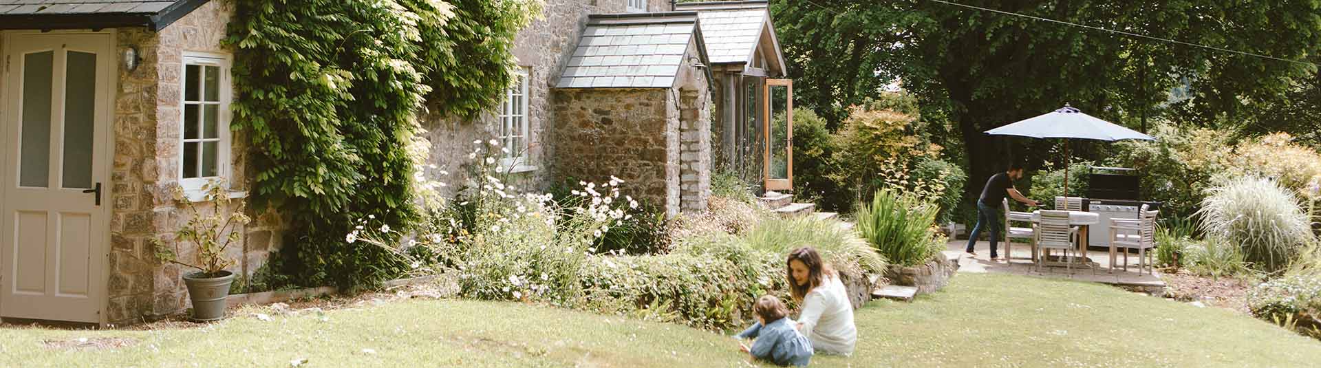
Choosing colour schemes for holiday cottages
How to holiday letInterior design for your holiday cottage
What does your holiday cottage say to you? What would you like it to say? Is clean and tidy good enough in today’s competitive market? Or should it have a professionally styled interior?
Whether you’ve an up and running asset or you’re starting from scratch, here’s some hints and tips to think about when making over your holiday home.
Paint colour can make or break a room so it's worth taking the time to think about it carefully. From first impressions to ease of furnishing, a blank canvas is an important starting point. So let's talk:
Colour
What is a neutral interior? For many, neutral means magnolia, a natural palette, a plain backdrop that doesn’t stand out. Shake off those assertions! Neutral can be anything but bland.
Before you start, it’s important to think of your scheme as a whole. Are you going to rub down and repaint those beams? Are the windows dark wood or white pvc? What about the flooring?
The walls tie all of this together so don’t just pick a colour because you like it.
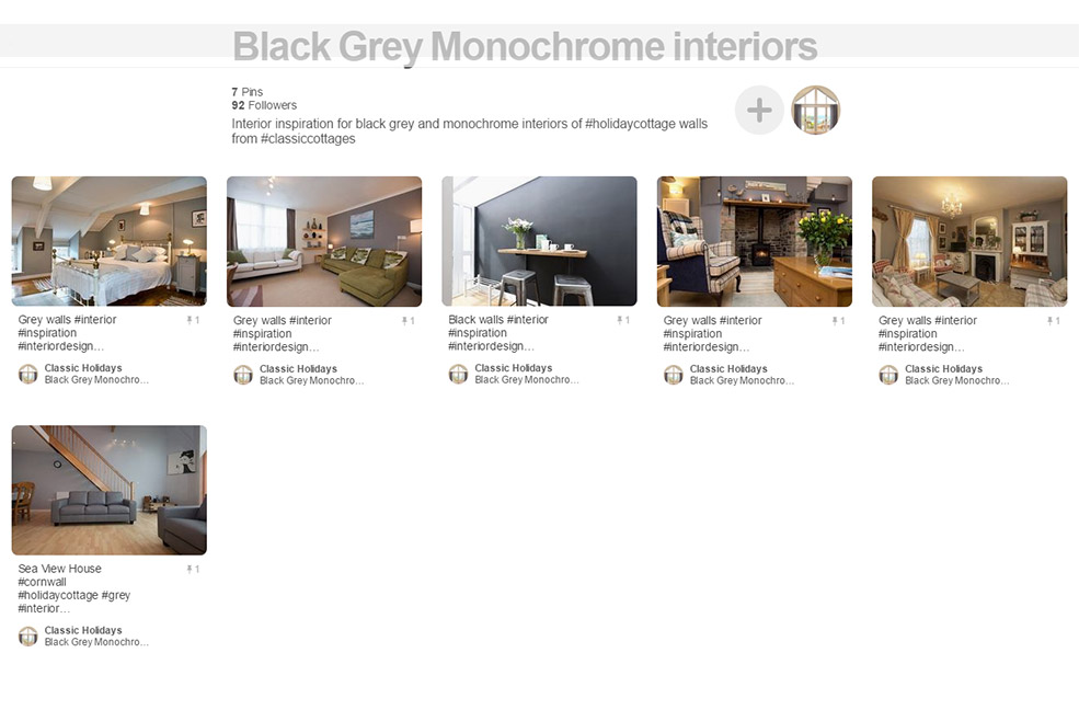
Find examples of colourful holiday cottages on our Pinterest page, or click the pics to head to the pinterest page for that colour.
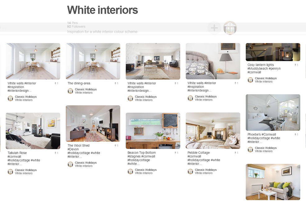
White
The epitome of the blank canvas, white is the perfect backdrop for accessorising. No longer stark, there are more than 50 shades of white on the market for discerning paint pickers. Think gallery walls, signature lighting, bright and airy backdrops. White is great for bouncing light around and is a modern take on magnolia. Magnolia is a softer look, but paired with the right accessories, white doesn’t have to contrast. Soften with pastels and natural hues for a spring like feel or go for small contrasting colour pops for a modern take on mid-century.
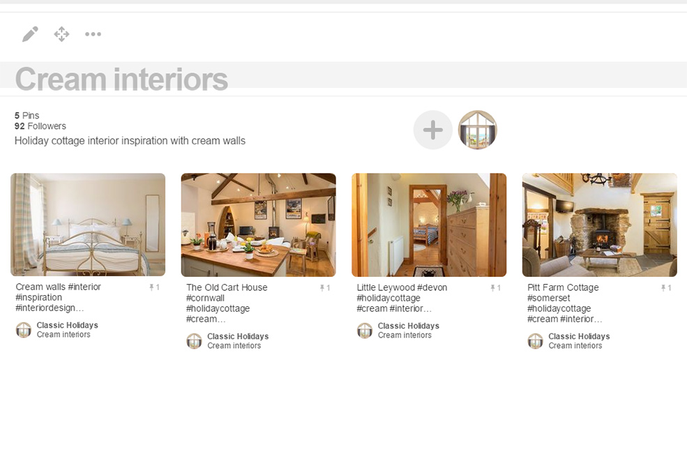
Cream
Whilst magnolia has gotten a bad rap as a backdrop to the 80s, it was popular for a reason. It’s a soft, safe option available en masse for a fraction of the price of trendier alternatives. The trick is not to date it with dark wood accessories – a modern magnolia should inspire a garden indoors. Think spring flowers and use it to highlight fresh greens, floral pinks and modern dark greys instead of brown. When choosing your cream, be sure to be picky with the tone – pair a cold cream (blue tint) with fresh pastel colours and warm creams (yellow or pink tints) with either white, or richer colours.
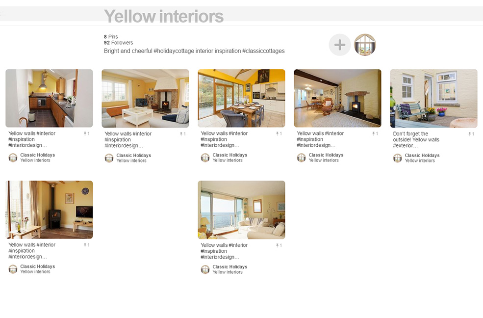
Yellow
The colour of sunshine and buttercups or insidious and sickly. Yellow can be surprisingly tricky.
It’s an oft-triggered trap to use yellow to brighten a room and many a kitchen has fallen foul of its subtle colour play.
Used correctly it brings joy, used badly it’s worse than magnolia. The main thing to avoid in this day and age is to avoid pairing it with brown, which immediately feels dated. It also has an amazing ability to clash with pine – the varnished variety, not the delightful scrubbed version that’s making a comeback in modern country interiors.
A muted buttercup works well in period properties, broken up with white dado and picture rails it can be a light and bright alternative to darker heritage hues.
A dark yellow complements a more Mediterranean feel, and brings warmth when paired with darker colours.
Be careful putting cold light yellows with greens – it can reflect a sickly light, and you may think you’re bringing in the beach when teaming yellow and blue, but too much of a good thing and you’ll tip the balance back towards the 80s.
It's also really difficult to take good photographs of a yellow room.
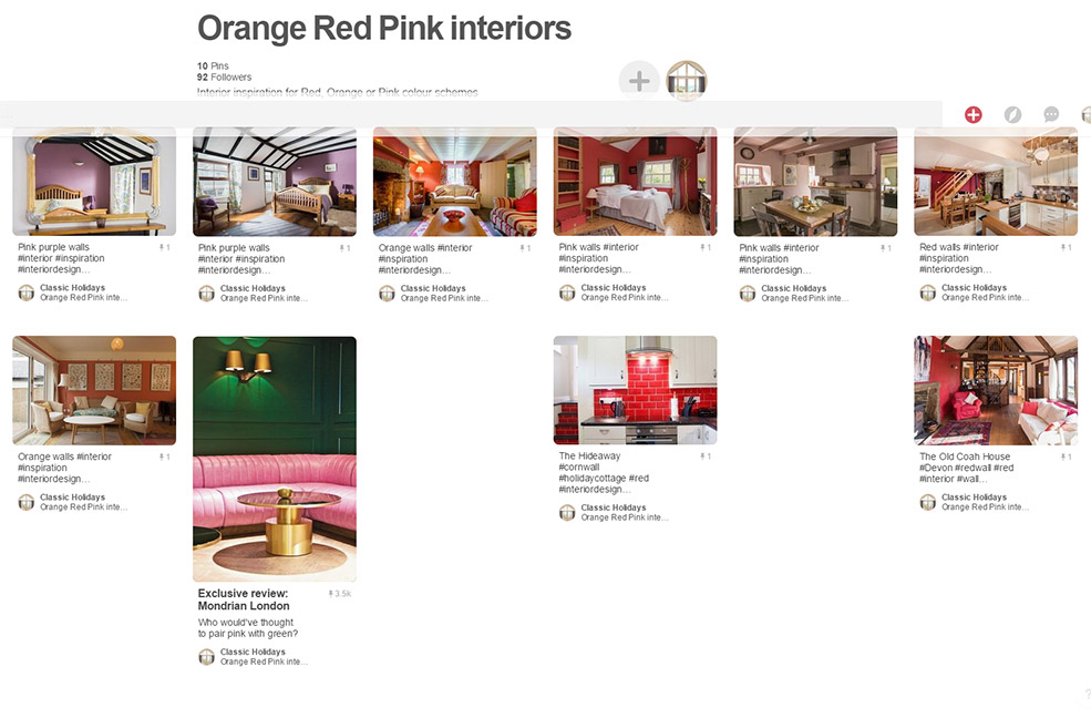
Red
They work well with the afore-mentioned Mediterranean look, but not many properties can pull that off. These are still not trendy colours for walls and are difficult looks to get right so unless you know what you’re doing, it’s probably best leaving that tin in the bargain bin.
That said, a strong modern interior can put these bold colours to good use – you ideally need a large, well lit room with high ceilings and set them off against black or white – other colours may cause a headache-inducing cacophony that’s hard to look at.
Of course they can be well suited to period homes – but heritage hues of burnt orange and blood red tend to be less garish and suitably toned to dark wood panelling and the like.
Pink, on the other hand, has seen a comeback. Coral works well with copper – a big trend for 2016. It complements turquoise blues and gives a warm cosy feel while still feeling fresh. You can use it in any room, which is always a bonus.
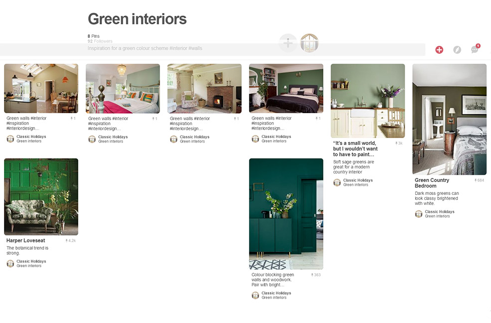
Green
Reminiscent of nature, it’s good for bringing ‘the outside in’, a trend that has really taken off the past few years – and doesn’t look like it’ll go away any time soon. It subconsciously evokes thoughts of good weather – picnic days, open doors, lush gardens, tropical weather…?
A pale green in a garden room helps merge the ambience and enhance an outdoorsy holiday feel with the warmth and rain protection of the indoors – and Mother Nature is very skilled at complementary colours so take inspiration from her to highlight pineapple yellows, fushia pinks and cornflower blues. Be wary of the browns once more as you could end up with too ‘foresty’ a feel, but keep the green pared back and it should work well with most things.
Moss greens, bottle greens and heritage green are all very much en vogue at the moment, creating a sophisticated elegance to a dining room, or a modern statement wall in a living room.
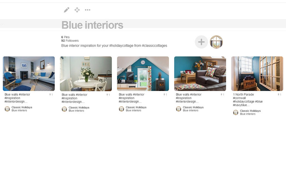
Blue
The colour of the sea and the sky, this is a popular colour scheme for coastal properties – white and blue say sailing and all this nautical without too much effort.
Blue has been a staple for eternity, a way of doing colour without being too offensive, you can’t go too wrong. Sky blue feels fresh and clean, mid blues bring colour without being in your face and dark blues are terribly trendy right now – think navy walls with copper accessories and the room will look like the pages of a glossy magazine.
Heed the warning in the yellow section about going too 80s, and only paint the woodwork if the walls are also blue and you’ll find most things fit together nicely.
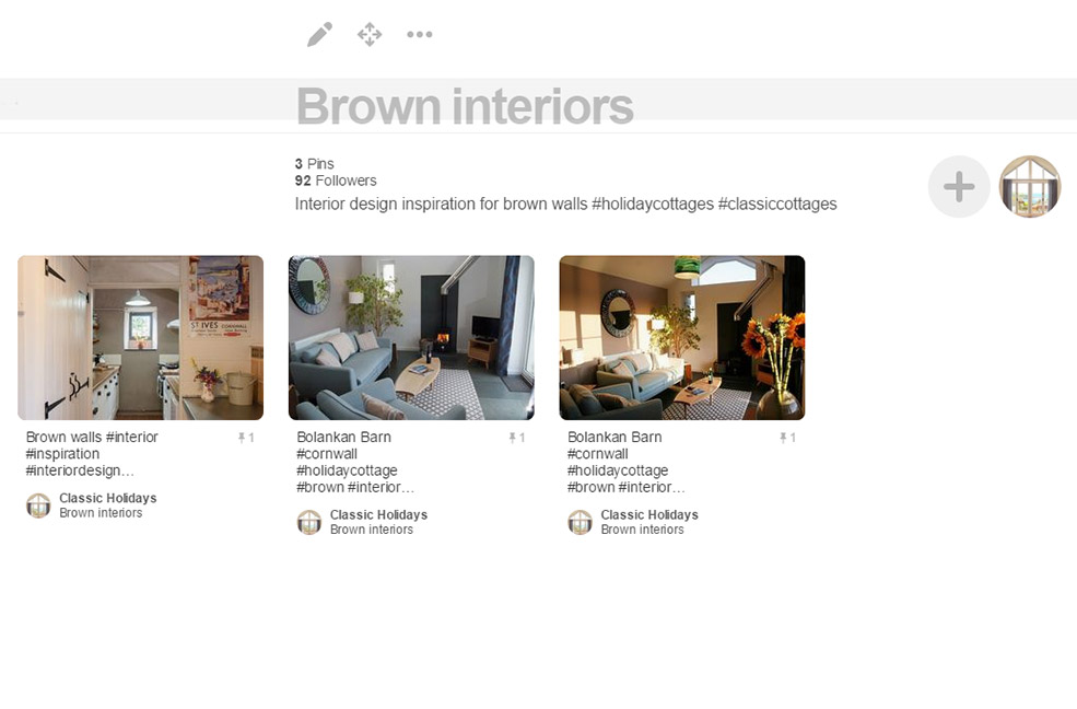
Brown
The colour that is mostly associated with nostalgia. Against yellow pine it’s hello 70s/80s, brown woodwork and you’re back in the 80s/90s. Coffee and cream enjoyed a little renaissance in the early 2000s but at the end of the day, it’s the colour of mud. It’s hard to stop it looking a little, well, grubby. Don’t get me wrong, brown can be classy – lots of expensive furniture and fittings are made from the most beautiful mahoganies and walnuts. But as a paint colour? Hard to get right.
The safest bet for a contemporary feel is to try a duck egg blue or a pistachio green – or stick to heritage colours that tend to tone well.
Black
Don’t rule it out! This section covers all tones – black is the new brown. Well, grey is. If you need to offset or neutralise, the best way is to go grey.
A neutral scheme used to mean creams and browns. Today it’s greys and whites. Grey is a great complementary colour – past associations were with a ‘grey day’, slightly miserable perhaps. But it’s now accepted that the many, many greys (I shall avoid saying 50) are classical and elegant in any setting.
A monochrome scheme can be soften with different shades and colour pops introduced with accessories. So pop in a black chair, paint a wall in blackboard paint (great for family friendly houses), even consider black carpet (hides red wine stains well) and soften the look with misty walls, taupe curtains, and grey woodwork.
It’s fashionable at the moment to extend the wall colour to the skirting and even the doors – be careful here. You either need to use the same (preferably) matt colour for walls and wood, or contrast it in a neutral white or grey. Painting the woodwork a darker colour or a contrasting colour will 99% of the time look wrong. There is the 1% that pull it off, of course.
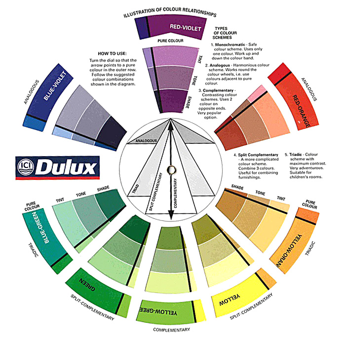
Colour wheels
Visualising colours together can be difficult. Luckily there’s lots of help out there.
Adobe have a great interactive colour wheel for intermediate users but for everyone else, Dulux explain simply how a colour wheel works and what the different terms mean:
Inspiration for your scheme
So, after all that, how on earth will you choose which to go for?
If you’ve a totally blank canvas to work from, the world is your colourful oyster and you can pick a scheme because you like it or because you want your guests to feel a particular way by presenting a particular look.
It’s best to work to your properties strengths – take inspiration from the history of the building or its surroundings. Bring the outdoors in with a garden scheme or play on coastal theme.
If you’ve an existing property that just needs a refresh, start with the things that can’t change – window colour, flooring etc and find a colour scheme to make the most of what you’ve already got.
At the end of the day, it’s your property and you should decorate it how you like it – just bear in mind that it makes sense to appeal to a broad audience when you’re trying to make money from it! Everyone has different tastes and perceptions but the holiday home should be a relaxing backdrop to set the scene for happy holidays. So, try not to get carried away…